A Slice of the Sky
It’s an uncomfortable thing to fall in love with a building you wish didn’t exist. Of all the supertall towers that have risen like flares, lighting up the city’s excesses and inequities, 111 West 57th Street, designed by SHoP Architects and erected by JDS Development, is by far the most thoughtful. As a statement, it’s infuriating; as architecture, it earns its place on the skyline.
There’s nothing new about that contradiction, of course. The mighty and the rich have been dotting the globe with splendors since power and wealth were invented, and the masses have beheld those self-homages with a mixture of resentment, gratitude, and rage. New York is a global principality overlaid on a democratic metropolis, and if the lords of capital are going to alight
June 9, 2021
New York Magazine
here, their supertall palaces might as well inspire some awe. Mostly, they don’t. Christian de Portzamparc’s One57 is repulsive. Gordon Gill and Adrian Smith’s Central Park Tower expresses the primacy of engineering over elegance. The cool symmetries of Rafael Viñoly’s 432 Park Avenue charm some but rouse amateur critics to fury. (Also, the elevators break down.) It doesn’t matter: These ventures’ only audience is a tiny club of potential buyers who experience them from the inside out. SHoP’s 111, however, works hard to seduce us all and to be a good New Yorker. Or as the firm’s founding partner Gregg Pasquarelli puts it, “If you’re going to put up a building that 8 million people can see all the time, it had better be pretty fucking good.”

The object in question is nearly 24 times taller than it is wide, making it by far the world’s slender supertall. That meant that it could be sutured to the landmark Steinway Building without swallowing it. (The narrow glass box that faces 57th Street as a retail entrance exists only because the zoning rules say it must.) The thinness also applies to its shadow, which moves along from any given spot in Central Park in a matter of minutes. A small square of land supports 60 apartments, 14 of them in the base, the rest stacked like casino chips in the tower. If you spread those households out over a dozen acres, we wouldn’t call it grotesque inequality; we’d call it a suburb. But in the heart of the city, the sky is a precious and limited resource.
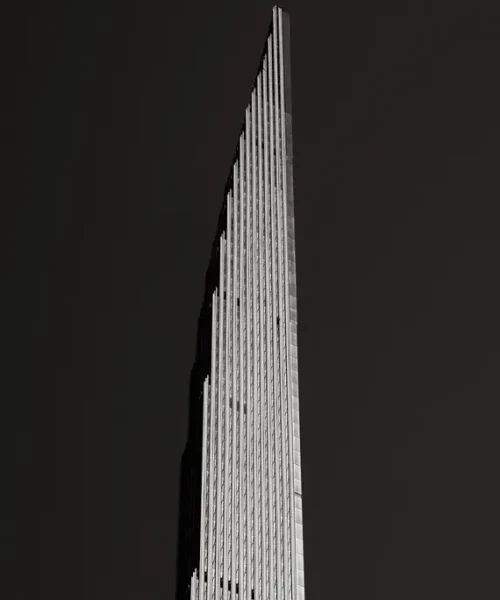
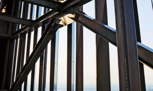
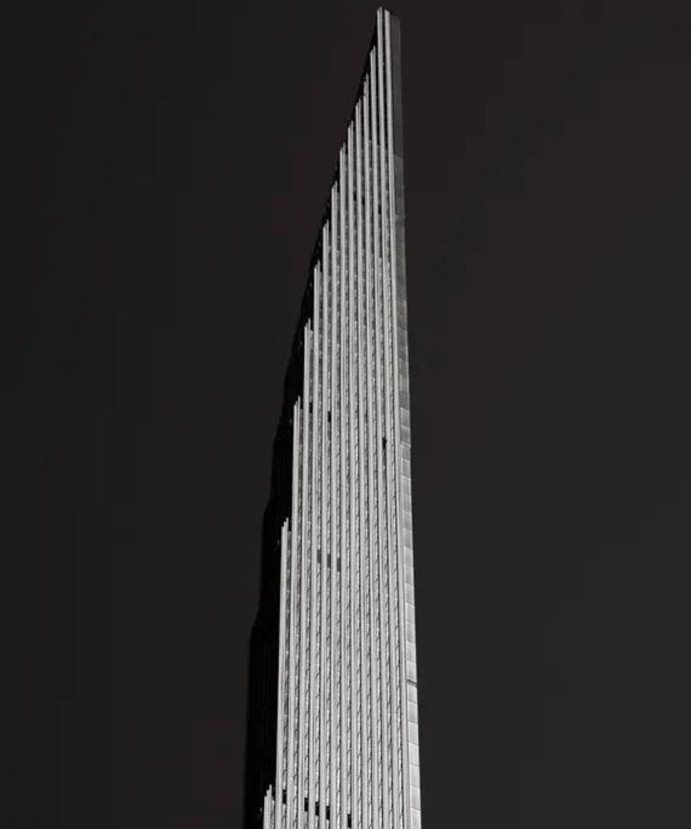
A century ago, the law that created the New York setback gave large buildings the presence of three-dimensional sculptures instead of just so many segments of street-facing façade. But 111 is unusual in that the most flattering sides are its flanks, not its front. What holds the thing together is a massive concrete H, solid toward the east and west and open to the north and south. Seen from the park, it’s a glass straw banded in brass. Look up from a few blocks along 57th Street, though, and it turns into a feathered quill, rippling with shadows and tapering to a sharpened point. The design’s achievement lies in how it achieves that taper, those shadows, and the swordlike combination of delicacy and strength.
June 9, 2021
New York Magazine
The saber’s hilt is the 1920s Beaux-Arts beauty by Warren & Wetmore that was once the home of Steinway, where the likes of Vladimir Horowitz and Sergei Rachmaninoff test-drove pianos. So much of the classical-music world has faded from this neighborhood: the managers, flacks, and hopefuls; the Patelson Music House, where you could browse the sale bin of symphonic scores and keep one eye on Carnegie Hall’s stage door; the studios above the hall, where Bernstein, Brando, and Agnes de Mille once lived along with generations of strugglers. If you heard Russian on 57th Street back then, it was being spoken by a violist, not an oligarch.
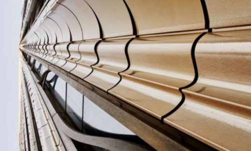
SHoP has literally plunged columns through the Steinway Building, leaving the landmarked rotunda room untouched, freshening up the exterior limestone, and renewing the copper roof. The pianos are silent, but the shell looks better than when the place was alive with arpeggios. Time ticks on; the whole point of music is to mark off its progress. Yet this kind of project virtually demands that architects engage with the past. The upper part of the old building is a brick patchwork of off-whites; the architects ordered six shades of cream for the tower’s façade. Terra-cotta and bronze embellish the obligatory glass, evoking both the Woolworth and Seagram buildings in counterpoint. Those waves along the sides are set in motion by more than two dozen terra-cotta forms, each a play of convexities and concavities that might have been pried from the cornice of a Baroque church. As your eye is cast upward, the sequence of those shapes creates the illusion of movement, an effect that will be sharpened once the exterior lighting is turned on. Like most fine ornamentation, these forms serve a purpose: They scatter the wind in much the same way a 19th-century auditorium’s plasterwork diffuses sound to give an
June 9, 2021
New York Magazine
orchestra that warm, complex sonic glow. The pilasters fall away one by one near the top, creating miniature setbacks in a graceful curve.


QUICK LINKS
CONTACT US
- 474 Broadway, 4th Floor, New York
- +1 (516) 881-7300
- info@eurasiastone.com
- 300 Babylon TurnpikeRoosevelt, NY 11575
- +1 (516) 881-7300
- info@eurasiastone.com

We pride ourselves on our attention to detail and commitment to customer satisfaction.We understand that your home is a reflection of your personality, and we strive to create a space that truly embodies your dreams and aspirations.
QUICK LINKS
CONTACT US
- 474 Broadway, 4th Floor, New York
- +1 (516) 881-7300
- info@eurasiastone.com
- 300 Babylon TurnpikeRoosevelt, NY 11575
- +1 (516) 881-7300
- info@eurasiastone.com
© www.eurasiastone.com 2025. All Rights Reserved.


 Eurasia Stone